Ibexa DXP v4.0 Preview: Redesigned User Interface Elevates the User Experience

Ibexa DXP’s user interface (UI) has undergone a major overhaul to improve the user experience (UX) and help editors and content creators save time and effort in their daily work. Based on feedback from our end users and the expertise of a newly established in-house UX team, we have revamped the graphic design and modified key functionalities to simplify navigation, promote focus, minimize confusion, and provide even more streamlined workflows.
This is the second in a blog series offering a sneak peek of new features included in the upcoming launch of our latest software version, Ibexa DXP v4.0. The previous preview blog post in this series presents Ibexa’s new Product Catalog – with the power of a PIM.
A significant part of Ibexa DXP's product development is based on feedback and requests from our customers and end users. Their input is invaluable to us when shaping new features or improving existing ones, because no one is better suited to provide such feedback than those who work the most in Ibexa DXP’s user interface. When performing repetitive actions daily, it becomes apparent which parts of the interface could be designed in a more intuitive or user-friendly manner to improve work efficiency and reduce the number of actions needed to complete a task.
A user-centered redesign process
The renewal of Ibexa DXP’s UI was initiated with the rebranding of eZ Systems to Ibexa and the establishment of an internal UX team dedicated to further developing and future-proofing the capabilities and user-friendliness of Ibexa DXP. The team works closely with colleagues in Engineering and Product Management to deliver enhanced tools and better experiences to our end users.
Natalia Becla, Senior UX Designer and team lead at Ibexa, explains her team’s approach to UX and UI design: “In our work we have implemented user-centered design (UCD), which is an iterative process, where designers focus on users and involve them in the design process at every stage. With the use of various frameworks and methods, we collected feedback from users and improved the product according to their expectations and business goals. The feedback collected from user testing acts as guidance for us, explicitly indicating which areas of UX and UI still need improvement and attention, to deliver the best quality product.”
Although Ibexa DXP’s UI has been continuously developed and enriched with new technology and capabilities since the company was founded in 1999, the time was now ripe for a highly structured, deep review of the UI and UX design to challenge the DXP’s navigation structure and overall graphic design. In cooperation with the biggest research agency in Poland, our UX/UI team embarked on an insight journey to uncover which aspects – visual and functional – of the UX/UI that should be prioritized in this redesign process.
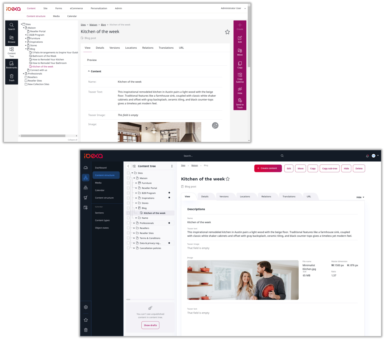
Current vs. new UI design: The new UI utilizes dark backgrounds to highlight key menu elements and a brighter background on the content space for optimal visuality and contrast. The current toolbar has been replaced with space saving buttons. Search is now visible in the header bar.
Natalia Becla describes the insight phase further: “At the beginning of the design process we launched a user testing panel. We engaged users whose profiles corresponded to our personas (reliable and realistic representations of the key audience segments for reference), from editors and e-commerce specialists to developers. Talking with users gave us much deeper insight into how Ibexa DXP is used.”
The purpose of the user testing panel was to bring user feedback into every step of the development process by identifying key pain points with the current UI and its navigation (information architecture), helping to validate the new UI designs, and testing the new design to identify its potential UX/UI problems and suggest improvements.
“We quickly realized although a lot of the changes we have made seem small, it was the cumulation of these small issues which built up into users feeling frustrated with the current product,” says Becla. “Their expectations are high, not surprisingly, as we all work with lots of different software applications. For example, if a table is sortable in another application, they expect to see the same in Ibexa. Similarly, Search was a key issue to resolve. We all use Google many times a day with instant and good results. So first we have tackled the issue to make Search always available on the top bar. We are still working on enhancing search quality but already we’ve made big strides in the right direction.”

Natalia Becla is Ibexa’s Senior UX Designer, with comprehensive experience in creating business applications. Most of her experience comes from designing SaaS web applications, where her analytical, design, and user research skills are put to work.
What’s new?
Although the user interface has been completely redesigned, it is so intuitive that existing users can get to grips with it swiftly. In addition, new users are likely to perceive the new UI so intuitive that they can do most tasks by themselves. Processes related to creation and editing of content items and products have been streamlined, unnecessary clicks have been eliminated by introducing context menus, and the graphic design provides more visual guidance by promoting key functionalities and frequently used tools.
Smoother navigation, more intuitive content management
Being able to navigate the UI in an effortless manner has a major impact on end users’ work efficiency and is a crucial part of the overall user experience, especially to users that manage a vast number of websites covering different markets or brands. One of the focus areas in Ibexa’s UI redesign process has been to improve navigation in the interface by restructuring parts of the information architecture to make the navigation within – and between – different sections and tools smoother and more intuitive.
“Our goal of reducing cognitive overload has meant we have put a lot of effort into ensuring that users do not tire of working with the product, they are able to quickly complete tasks and be more efficient.”
Graphic redesign promotes focus
The UI’s new graphic design affects most features and tools. The main navigation section’s background has been darkened to make tool tabs and icons stand out, and to separate the navigation section from the content area (where content is managed). The content area’s background color is kept white for many reasons, among them are contrast, text visibility, and readability.
The clear demarcation, by colored panels, helps users to focus on tasks they are doing, as mentioned above, the white area is where they create content. The brighter, gray area showing the content tree is for easy navigation between different parts of a website. The dark blue left-hand panel is where users can navigate the backend of the platform. The furthermost left-hand panel with icons is a higher level of navigation still, showing the different modules in Ibexa DXP.
New visual elements such as redesigned icons, tabs and buttons have been introduced to make work easier for users and help user flow by reducing the number of clicks or actions they need to make to complete a task. For example, a primary button is now a red, and by using this intense color, users can speed up their work as it becomes more intuitive what action they need to make, and they don’t need to search for it. The new designs were described as attractive, modern, fresh, and clear in user testing and users expressed that the new navigation would help them be more efficient.
Ibexa’s new Product Catalog feature, which will be introduced with Ibexa DXP v4.0, has been developed simultaneously with the new UI to ensure streamlined management of potentially thousands of products. The flow of key actions, navigation and button labelling in Product Catalog are results of the insight process, and the user testing panel verified that the new UI supports typical user workflows. Users with current PIM systems or other product management tools, and complex product offerings, figured out most of the tasks they were asked to perform during the user testing. They found the flow of a task logical and clear; the new UI design was assessed as a great direction among current users and easy to grasp by first-time users.
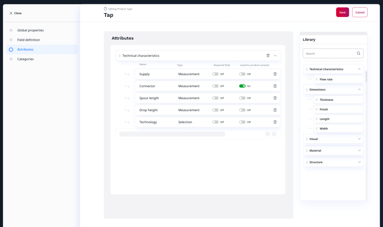
The new Product Catalog feature: Different attributes (product characteristics) or attribute groups can easily be assigned to product types with the straightforward drag and drop interface.
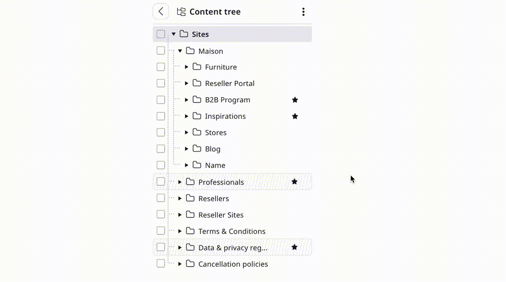
Managing digital content (articles, images, videos, documents, etc.) for multiple websites requires a well-organized content management structure that provides a good overview of all content and easy access to it. The revamped UI reintroduces the contextual menu in Ibexa’s popular content tree, which enables you to do several time-saving operations directly in the content tree: moving, copying, or deleting content items, and expanding or collapsing content tree menu sections. This gif shows how to move a content item:
The drag and drop functionalities provided by the new UI enable easy management of different content items and settings in features like Page Builder, Ibexa Personalization, and the new Product Catalog. This simple way of managing web pages, products, and different settings is applied to other actions in the new UI as well, e.g. when defining content types.
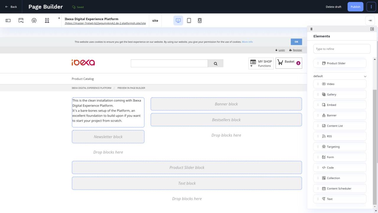
Popular feature in new wrapping: Ibexa’s Page Builder enables you to build new web pages quickly and efficiently using predefined templates and easy-to-use drag and drop content blocks to add different content parts to the page.
Several enhancements to Ibexa Personalization will be delivered with Ibexa DXP v4.0 in addition to the visual improvements provided by the new user interface.
Ibexa DXP v4.0 – coming soon!
The new user interface will be launched with Ibexa DXP v4.0 during the first quarter of 2022 and will be implemented in all Ibexa DXP products; Ibexa Content, Ibexa Experience, and Ibexa Commerce. Other enhancements will be added to the UI in subsequent versions.
If you would like to discuss how you could leverage your product portfolio on an advanced Digital Experience Platform, please do contact us.
Product Launch Webinar
Discover Ibexa DXP 4.0
Get insight into the new features and updates included in Ibexa DXP v4.0:
- Our brand new Product Catalog feature, which is a DXP-native PIM (Product Information Management) component
- Ibexa DXP’s redesigned user interface (UI) as well as enhancements to Ibexa Personalization and Ibexa DXP’s taxonomy capabilities.
![[Webinar] Introducing Ibexa DXP v4.0](https://www.ibexa.co/var/site/storage/images/_aliases/ibexa_listing/7/4/5/9/249547-1-eng-GB/e85ca54051d7-ibexa-dxp-v4.0-cta-image.png)