Improving eZ Platform User Experience for Editorial Teams

We recently released v1.13.2, and with it came several notable fixes and improvements for 1.13LTS users:
- The draft conflict widget is now also used on Landing Page Editor [Enterprise Edition]
- HttpCache improvements to cache more Platform UI REST requests, and clear reverse relation cache on publish operations, but only when applicable
- Reduced PHP memory usage on file uploads (content edit) by about 40%
- Fixed cases where relations still listed after sending them to trash in Platform UI
Full list of improvements can be found on eZ Platform and eZ Platform Enterprise releases change log.
A story of how we work with Enterprise customers
For some background on these improvements, it's worth mentioning how we are aiming to work with our Enterprise customers, though this is not unique to this improvement, we do this across a lot of the changes you see-including in our latest release.
Across our organization, especially in the customer-facing areas, we are focused in learning how our customers use and experience our software. This in turn informs the relevant area of our organization, which helps us better discover, design and prioritize future changes to our product. We do this because our success in the long run is directly dependent on our customers' success with our software.
This particular change is a good example of that. The customer who provided feedback to us is in the News industry, has a large editorial team spread across the world, and they typically spend extensive time working on content in the CMS. They are a key customer within one of the markets we especially care for and optimize eZ Platform for.
Their feedback was quite simple: The Paragraph toolbar is inhibiting basic editorial tasks and hence was annoying the team.
They also asked if the toolbar could behave more like a standard Alloy.
Some background on the Online Editor, and it's usage of Alloy
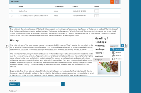
At this point, it is worth diving into the background of the Online Editor, our RichText Editor. It is based on Alloy Editor, which in turn is based on CKEditor.
Back when we decided to use Alloy, we noticed that we needed more advanced block handling than what it offered. We knew we needed capabilities such as moving blocks up and down, removing them altogether, controlling their alignment, or switching between header levels and between image sizes. And back then there were indications from the Alloy team (Liferay) that the changes we intended to do were perhaps not the direction they wanted for the project itself, ruling out contribution (for now).
This is how the custom toolbar handling for blocks was born. And in our initial user testing, it fared quite well.
User testing is something you ideally never stop doing
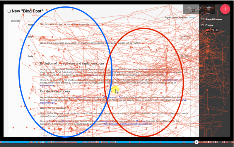
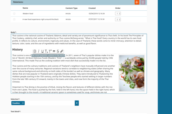
Almost in parallel to the issue our customer reported in regards to the toolbar, our Product Management team had already been running a series of user testing sessions and this issue was also turning up. The major pain point detected showed users clicking above the paragraph they were working on to move the toolbar up to be able to read the content just written (a very usual task when editing or creating content).
A common use case showed a user clicking an average of 25 times for a long editing workflow, about 45 minutes. Users' tricks to avoid the Online Editor toolbar? Clicking on two paragraphs above; clicking one paragraph below; or clicking outside of the Input Rich Text box, as seen on the clicks on the right toolbar.
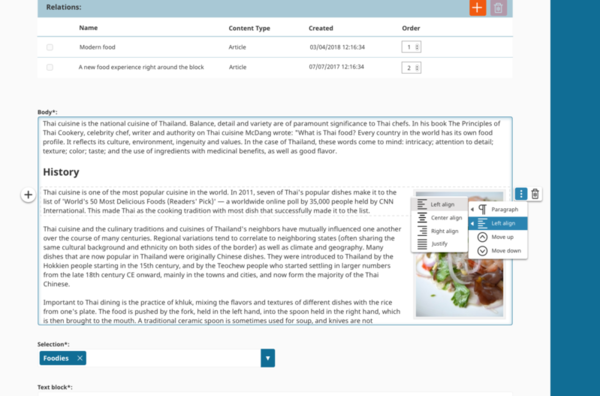
Another interesting finding related to this paragraph toolbar pointed out that alignment buttons are barely used when performing common editorial tasks. In addition, we also detected the need for improvements in other toolbars that are part of the Online Editor.
So when the customer request came through, we were ready to work together with them. We already had the background knowledge plus a good hunch of what was the customer's real issue.
Changes available as of last week v1.13.2 release
To address our customer's feedback we decided to split the efforts into two scopes-one short-term for v1.13, and one mid-term for v2.
For v1.13, we sought out a few different approaches:
- Introduce larger margins between blocks and slim down the toolbar to fit within those margins
- Hide the toolbar while typing
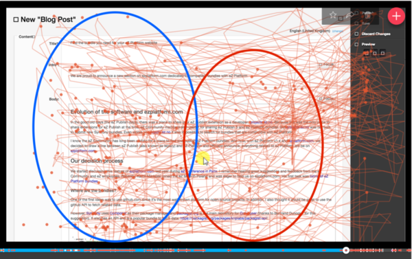
However, after iterating with our customer's team and testing them, both of these approaches proved to be clunky or janky. So in the end, we looked into attaching the toolbar to the top of the editor, which proved we needed to handle cases where the top of the editor is not visible within current browser view.
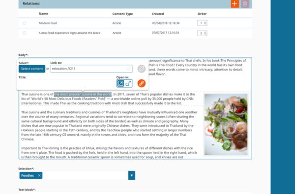
The final resolution, which the customer was satisfied with, is the following:
Thoughts on where to take this in the future for v2
When we decided to improve our Online Editor experience from eZ Publish Platform to eZ Platform v1, we wanted a solution to write rich editorial content with ease, efficiency and comfort via a refined and simplified Online Editor. Our main objectives were:
- Contextual toolbars - with customized UI clearly and explicitly showing users which actions are the only ones available for a specific element in a given context
- Styling at all levels - via a UI that helps the user apply style changes to inline content, as well as to the block level element, like paragraphs. As a result, the UI is optimized for every element (a heading, a paragraph, an image, etc.)
- Distraction-free editing - we're giving users the ability to edit Body content on its own interaction layer so the users are narrowly focused on their edits, rather than being distracted by other fields and buttons. Unnecessary buttons and functions are removed while only the most essential remain
- Extensibility point - all these feature improvements came, as usual, with the requirement that developers and partners can simply add new elements or remove them as needed
Editorial UX is a key driver in the choice of a CMS. That's why ease-of-use and speed are our main focus for the upcoming improvements in this fall's Fast Track release, including for the Online Editor.
The feature improvements in the upcoming Fast Track releases rely on placing content at the center of the editorial experience. This is one of the most important aspects we have learned from our exchange with this specific customer in the News industry but also with customers in other domains-and it's something we truly agree on.
Among the things we consider for v2 improvements:
- Moving actions in the toolbar within the editor to an interaction bar on the right, clearing out the editing view
- Toolbars are lighter and cleaner, using less space
- Top and bottom view of content is cleared, prioritizing common editorial tasks
Call for feedback
The Online Editor is possibly one of the most important features in eZ Platform, when it comes to editorial experience. That is why we wanted to share regarding this specific change, and also gather wider feedback on the other changes proposed above.
We would like to gather feedback related to these improvements to the editorial experience of eZ Platform users. We invite and welcome all of your comments and ideas, please feel free to comment below or send them out to productmanagement@ez.no.
eZ Platform is now Ibexa DXP
Ibexa DXP was announced in October 2020. It replaces the eZ Platform brand name, but behind the scenes it is an evolution of the technology. Read the Ibexa DXP v3.2 announcement blog post to learn all about our new product family: Ibexa Content, Ibexa Experience and Ibexa Commerce